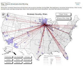
I came across a great interactive map from Forbes the other day (yes, they published the map a few months ago... but the information is great). If you click on any county on the map it will show you the inbound and outbound movement for that county... including lines that show where people are moving to and from.
On the map... RED lines show the out-migration* from the county and in-migration* is shown in DARK GREY/Black for households that moved in 2008. While the data is a few years old... there's no reason to think that the trend would have changed too dramatically in the last year and a half.
As an example, here's the migration map for Ramsey County:
If you want to see a REALLY scary picture... click on Detroit (Wayne County, MI).
The interactive map is here.
*NOTE: I've chosen to use the terms out-migration and in-migration instead of Emigration and Immigration... as those terms tend to refer to movement outside/into the country. The movements represented on the Forbes map show the movement of US residents only to and from OTHER US counties.

No comments:
Post a Comment
This is a moderated blog. That means all comments will be reviewed before posting. In addition, we expect that participants will treat each other, as well as the Center, our Counseling Network and other partners, with respect. We will not post comments that contain vulgar or abusive language; personal attacks of any kind; any offensive terms; spam; are clearly “off topic” or that promote services or products. Comments that make unsupported accusations will also not be posted.