Over the past few years of the foreclosure crisis in Minnesota, both housing industry professionals and social service agencies have requested an easy-to-use map of service areas covered by the Center's network of foreclosure counseling agencies... that they could print out and keep handy.
Now, the Center has produced a new printable map showing foreclosure counseling services provided by the Homeownership Advisors Network and the geographic or language service area they cover. This map is intended to be a reference tool for professionals as a supplement to the interactive online map.
 (Click To Enlarge - Use Link Below For High Quality Print Version)
I came across a great interactive map from Forbes the other day (yes, they published the map a few months ago... but the information is great). If you click on any county on the map it will show you the inbound and outbound movement for that county... including lines that show where people are moving to and from.
On the map... RED lines show the out-migration* from the county and in-migration* is shown in DARK GREY/Black for households that moved in 2008. While the data is a few years old... there's no reason to think that the trend would have changed too dramatically in the last year and a half.
As an example, here's the migration map for Ramsey County:
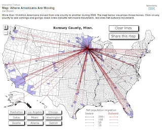 (Click To Enlarge)
If you want to see a REALLY scary picture... click on Detroit (Wayne County, MI).
The interactive map is here.
*NOTE: I've chosen to use the terms out-migration and in-migration instead of Emigration and Immigration... as those terms tend to refer to movement outside/into the country. The movements represented on the Forbes map show the movement of US residents only to and from OTHER US counties.


